My Chemical Romance Asia Forum
Would you like to react to this message? Create an account in a few clicks or log in to continue.


Where all Asian Fans Unite
 
HomePortalGallerySearchLatest imagesRegisterLog in


 Logo 2...

Go down 
4 posters
AuthorMessage
platypusgdfan
Chemical Missiles Proffesor
platypusgdfan


Number of posts : 560
Age : 33
Location : Malaysia
Registration date : 2008-10-07

Logo 2... Empty
PostSubject: Logo 2...   Logo 2... EmptySun Dec 28 2008, 22:58

Logo 2... Mcrasiaforumlogo2

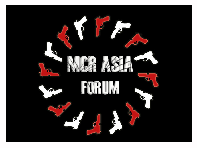
This is the second one that I made...

Made in Photoshop 7 as well.
The font is also on the laptop.
Note: This one have more of a splatter effect with the words standing out more. The music notes on the background indicates that this forum has something to do with music. And the keyboard keys beneath the word, forum, was intentional in the sense of representing PC/laptop keyboards.

Erm... that's it I guess....
Back to top Go down
http://platypusgdfan.blogspot.com
summersnow
Thermobaric Manager
Thermobaric Manager
summersnow


Number of posts : 958
Age : 34
Location : Malaysia
Registration date : 2008-01-02

Logo 2... Empty
PostSubject: Re: Logo 2...   Logo 2... EmptyMon Dec 29 2008, 18:21

wow..this is a good one!!...
good interpretation too...^^
llove the background...the redish thingie...matches mcr!
Back to top Go down
metalslugx
Nuclear Species
Nuclear Species
metalslugx


Number of posts : 1672
Age : 36
Location : Pirate Ship
Registration date : 2007-12-25

Logo 2... Empty
PostSubject: Re: Logo 2...   Logo 2... EmptyTue Dec 30 2008, 15:43

i love the reddish thingie too =D but i didn't like the notes...it's so like classical
Back to top Go down
https://mcrasiaforum.forumotion.com
ladyofsorrows
Sleepwalking into Gee's hands
ladyofsorrows


Number of posts : 1700
Age : 35
Location : In Gerard's hands
Registration date : 2007-12-28

Logo 2... Empty
PostSubject: Re: Logo 2...   Logo 2... EmptyTue Dec 30 2008, 17:40

It'd be better off if the fonts are bigger. There's too much space but damn, great interpretations.
Back to top Go down
http://of-silverandsky.blogspot.com/
platypusgdfan
Chemical Missiles Proffesor
platypusgdfan


Number of posts : 560
Age : 33
Location : Malaysia
Registration date : 2008-10-07

Logo 2... Empty
PostSubject: Re: Logo 2...   Logo 2... EmptyTue Dec 30 2008, 18:33

Thanks guys for the comments! Smile I'll try to work on it! Thank god there's a postponed date! Lol.
Back to top Go down
http://platypusgdfan.blogspot.com
summersnow
Thermobaric Manager
Thermobaric Manager
summersnow


Number of posts : 958
Age : 34
Location : Malaysia
Registration date : 2008-01-02

Logo 2... Empty
PostSubject: Re: Logo 2...   Logo 2... EmptyTue Dec 30 2008, 20:50

owh yeah....i think the notes make it looks more classical...try to make it more rock like mcr's style...and u should change the font to bigger size or maybe another pattern then it'll be perfect...
Back to top Go down
platypusgdfan
Chemical Missiles Proffesor
platypusgdfan


Number of posts : 560
Age : 33
Location : Malaysia
Registration date : 2008-10-07

Logo 2... Empty
PostSubject: Re: Logo 2...   Logo 2... EmptyWed Dec 31 2008, 16:10

Alright! Smile Thank you so much for the comment! Smile
Back to top Go down
http://platypusgdfan.blogspot.com
Sponsored content


Logo 2... Empty
PostSubject: Re: Logo 2...   Logo 2... Empty

Back to top Go down
 
Logo 2...
Back to top 
Page 1 of 1
 Similar topics
-
» Logo 1...
» my logo design
» Vote for the Best Logo
» Logo/Banner contest Brief [PLEASE READ]
» Logo/Banner Design Contest [COMPLETED]

Permissions in this forum:You cannot reply to topics in this forum
My Chemical Romance Asia Forum :: MCR Asia Forum :: Art Addiction :: Logo/Banner design contest-
Jump to: